[Webinar] Leveraging Social Media Trends for Brand Engagement
Unlock the secrets to staying ahead in the ever-evolving world of social media marketing.
Save your seat
Unlock the secrets to staying ahead in the ever-evolving world of social media marketing.
2/3 of the Forbes 100 most valuable brands trust Brandwatch,
the social suite built for our fast-moving world.
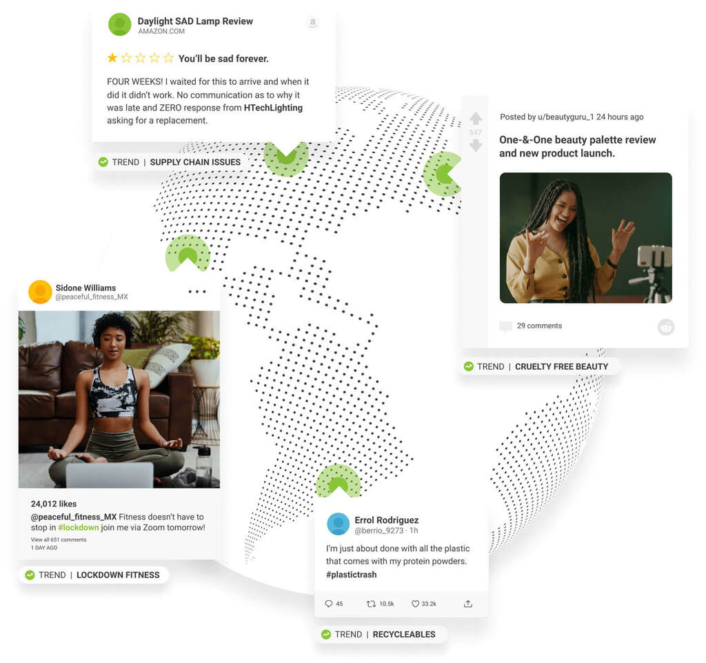
Anticipate consumer demand by bringing structure and meaning to billions of voices
Survive and thrive in a fast-moving digital landscape by keeping your finger on the pulse of consumer opinion
Grow your brand with a data-driven content strategy all managed in one collaborative social content calendar
Deliver exceptional customer experience by engaging with the right people in the right place at the right time

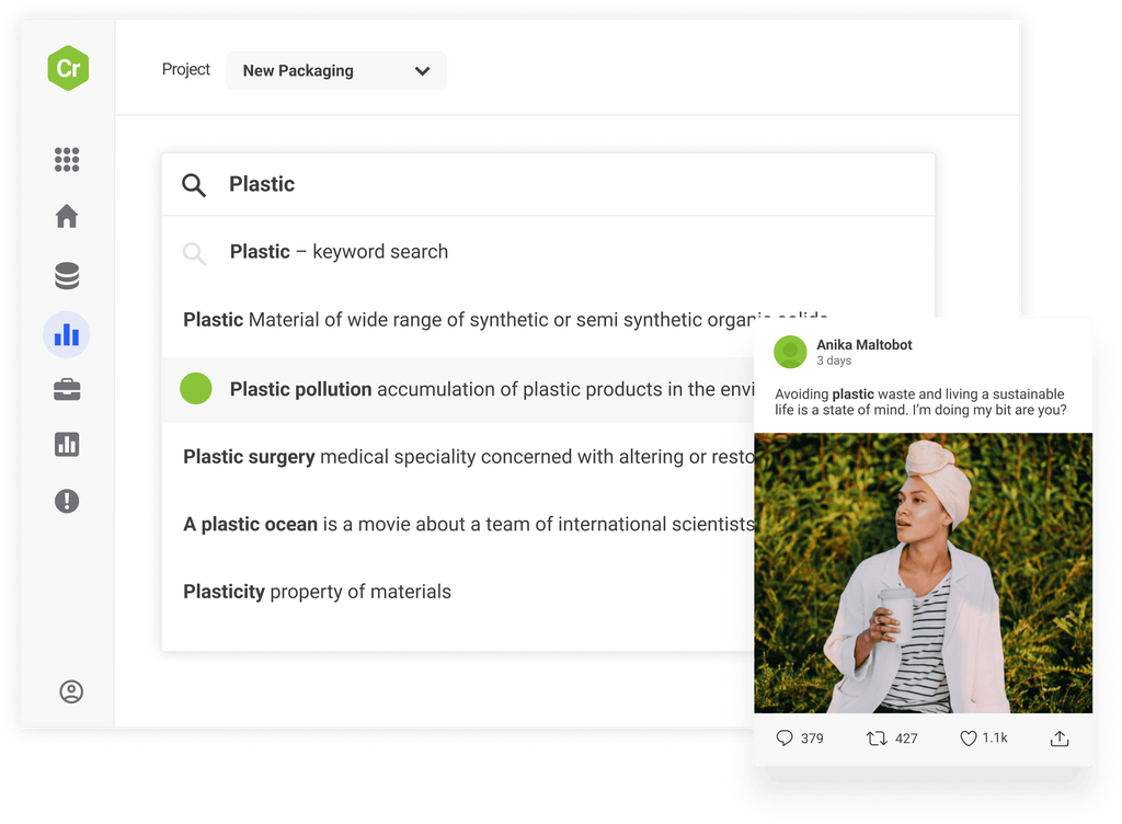
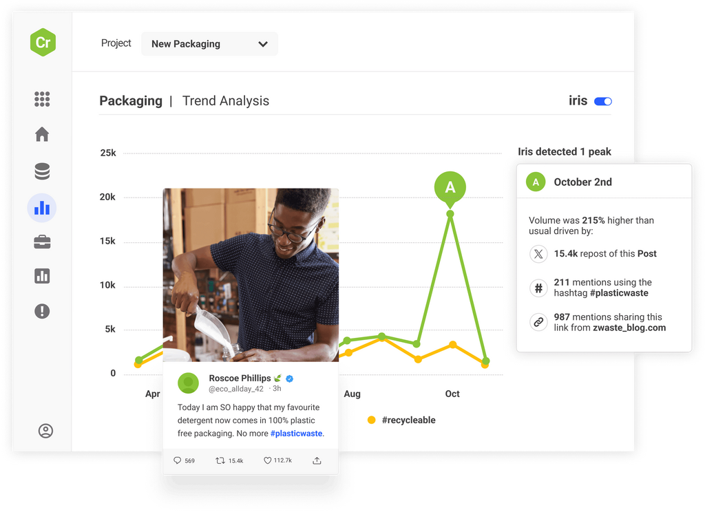
Access the world’s largest archive of consumer opinion and leverage industry-leading AI to discover new trends before anyone else and make smarter decisions.
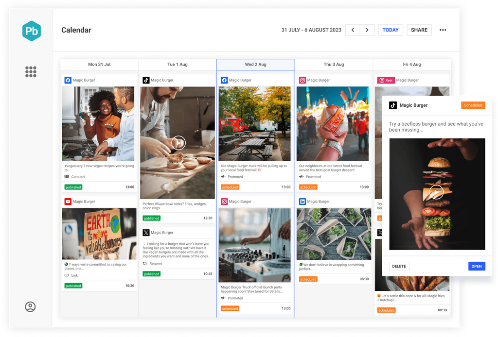
Manage channels, teams, workflows, approvals, and campaigns and ensure brand alignment and stellar quality in one collaborative content calendar.
Monitor emerging threats across over 100m sources and set up smart, real-time alerts to respond with speed and confidence before problems develop.
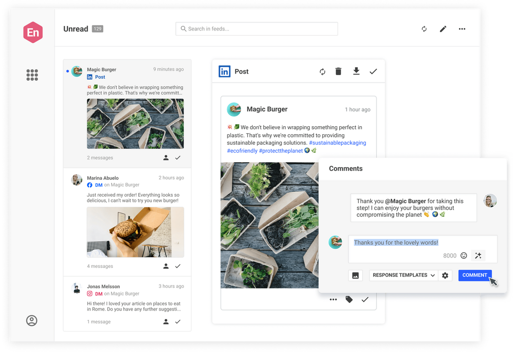
Take the stress out of community management and customer support. Engage customers and prospects with one social inbox for all your networks.
When your social strategy is executed well and informed by robust, unique insights you’ll get a competitive edge that produces measurable results. Don’t just take our word for it, see how some of our other clients did it.
Jaya Deshpande, Principal Social Analyst, BBC
Select your job role, your industry or your use case and we’ll show how Brandwatch can help.
Brandwatch solutions are consistently recognized as leaders by industry analysts and the customers who rely on them to better understand and engage with their consumers.
Existing customer?Log in to access your existing Falcon products and data via the login menu on the top right of the page.New customer?You'll find the former Falcon products under 'Social Media Management' if you go to 'Our Suite' in the navigation.
Brandwatch acquired Paladin in March 2022. It's now called Influence, which is part of Brandwatch's Social Media Management solution.Want to access your Paladin account?Use the login menu at the top right corner.