5 Benefits of Combining Social Data with Search Data
By Emily SmithMar 25
Only 25% of marketers truly understand their audience. Do you? Join us for a candid conversation and discover the tools and skills top marketers are using in 2026.
Published February 1st 2019
We've put together a list of the best data visualization tools avaliable. From free to paid, they include all types of charts and maps.
There are so many data visualization tools out there that it can be hard to find the best one for the job. They all do slightly different things, with a range of free and paid plans. So, we’ve put together a list of the best tools out there.
We’ll be continuously adding to this as we find and try new tools. If you have any suggestions, let us know.
Right. Let’s get to it.
Chart Types: General, interactive, maps, mathematical and scientific.
Difficulty: Takes a bit of practice.
Cost: Free with some paid plans.
Plotly is one of the best general-use data visualization tools out there. It offers a lot of customization compared to other free tools along with a good level of interactivity. All the charts can be exported as images or embedded (HTML and iframe code is supplied) too. It can take a little while to get used to the tool, but essentially you can plug some data in and get started straight away.
Two standout features are the fact you can store your charts and data within your account and set up folders to organize everything. It also has an excellent feature for creating multi-chart visualizations which can be great for some purposes, particularly when comparing datasets.
Chart Types: General, interactive, maps, Twitter timeline, and other unique, interactive charts.
Difficulty: Pretty straightforward, some charts take a small amount of time to get used to.
Cost: Free with some paid plans.
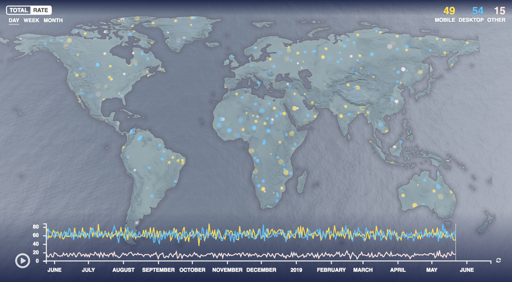
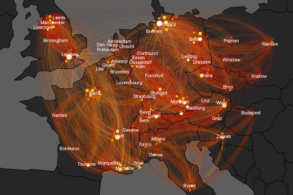
Flourish is a truly fantastic tool. It’s got a solid range of standard charts, with some extra animation on loading plus useful interactivity. There’s some excellent built-in color ranges, along with the option to create your own. There’s a decent amount of customisation too.
Where Flourish really stands out is on some charts you’re unlikely to find elsewhere that can be created so easily.
In the image above, you can see a still from an animated map that shows points over time. There’s an interesting Twitter timeline chart that’s great for events, plus the survey visualisation is incredible. The ability to sort and compare by different data points makes it a great visualisation and handy for analysis.
Chart Types: General, interactive, maps, dashboards, and infographics.
Difficulty: Takes a bit of practice.
Cost: Free.
Tableau is a massive name in data. While they have other paid products that do a load more, for this we’re just talking about Tableau Public. This is a free piece of software you can download and create data visualizations with. It’s got a good range of types, while there’s a lot of scope for customization and design.
You can also combine charts into one piece of content to create interactive dashboards and infographics. There have been some great pieces of work created with this tool. Having said that, you’ll need to go through their tutorial to get the most out of it.
Chart Types: General and interactive.
Difficulty: Open to everyone.
Cost: Free.
Highcharts Cloud is one of the easiest to use data visualizations tools, and it still looks really good too. This is a free solution offered by Highcharts who have a load of other visualization products you can find here. The tool has your general charts, while all you need to do is enter some data and you’ll have a nice, clean visualization.
The downside is that there isn’t much customization here. You’re quite limited on what the chart will look like and how the data is displayed. But if you’re after a quick and simple visualization, you don’t need to worry about that anyway.
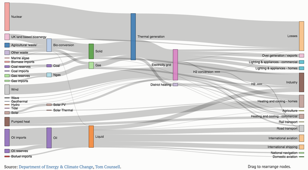
Chart Types: General, interactive, maps, scientific, mathematical, and technical.
Difficulty: You’ll need a developer for this.
Cost: Free.
D3.js isn’t a tool a such, it’s a a Javascript library that’s used to create data visualizations. This means you’re going to need someone with some dev ability to help you out if it’s beyond your own skills. D3.js is incredibly powerful and versatile though, so it’s worth the effort to get to grips with. There are a number of tutorials out there to help you as well.
In regards to what you can do, the options are massive. As it’s all done through coding, you don’t have to worry about restrictions that other tools have. It does everything from basic line charts to entirely unique and obscure visualizations you might not have even heard of. The best bet is to check out the examples here to see what’s possible.
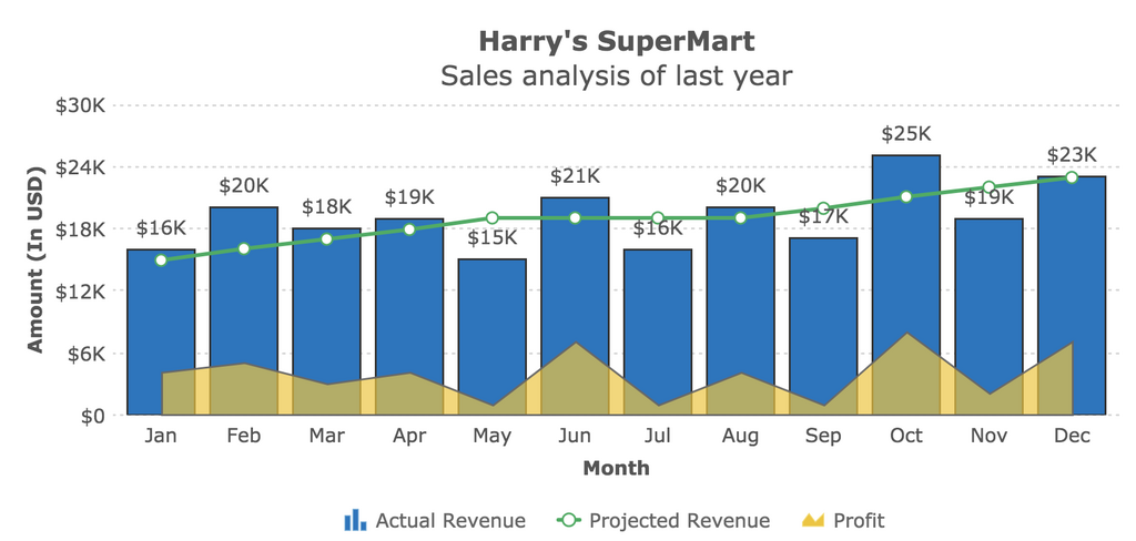
Chart Types: General, interactive, and maps.
Difficulty: You’ll need a developer for this.
Cost: Minimum is $199 a year for a single license with a range of plans above that.
Another Javacript library, but not free this time. FusionTables is a paid product that includes 90+ charts and a lot of variation and customisation. They also have a wide range of maps as well.
FusionCharts seems more geared towards businesses and reporting than content. That might explain why a lot of their examples look a bit dated (plus there’s the use of the dreaded 3D pie chart). One plus is you’ll get proper support while using the product. Certainly worth a look depending on your needs.
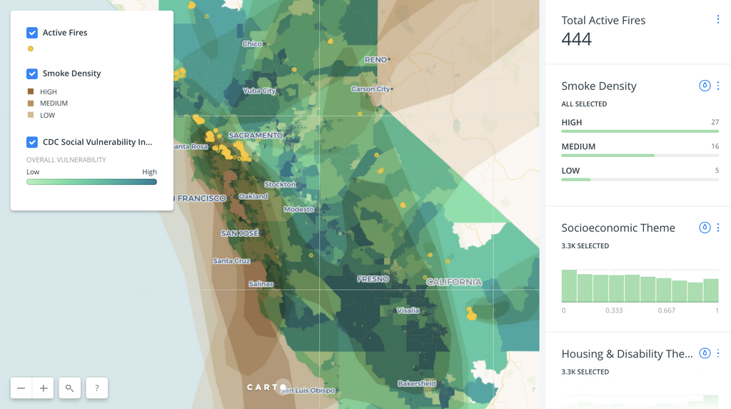
Chart Types: Interactive maps with some in-chart functionality for histograms.
Difficulty: Takes a bit of practice.
Cost: Free with paid plans to unlock more features and data.
If you’re after interactive maps, Carto is probably the best tool out there. Used for location intelligence and and journalism alike, you can create some impressive maps without much technical knowhow. The in-built wizard means you can create some sophisticated stuff without writing a line of code.
It will take some getting used to though, particularly in regards to some file formats you might not be familiar with. Working with a dev will make Carto less restrictive and more powerful, so it’s worth looking into that. Otherwise, spend a bit of time reading up and playing around and you’ll get the hang of it pretty quick.
Chart Types: Maps.
Difficulty: Takes a bit of practice.
Cost: Completely free.
QGIS is all about maps, the ‘GIS’ in the name standing for ‘geographical information system’. It’s free and open source, and is a piece of software rather than a tool in a browser. It’s very powerful with some great functionality for producing high quality content. There are a lot of built-in tools for data manipulation, analysis, and visualization (plus a ton of plugins you can download).
It’s a tricky tool to learn though. You won’t be able to just dive in and get to work. Spend some time on tutorials (this being a particularly good one) and get some practice in. It won’t take too long to get simple maps under your belt, but it’ll take a bit of work for the more complicated stuff.
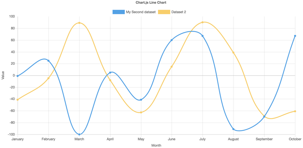
Chart Types: General.
Difficulty: You’ll need a developer for this.
Cost: Completely free.
Another code-based offering here. Free and open-source, Chart.js isn’t the most extensive of options (it has eight charts to choose from), but it’s got a great style. The design is clean and minimalistic – always a plus in data visualization.
As this is is all Javascript based, you’ll need a dev to help you out, but there’s some nice functionality that makes it worth it. The interactivity on these charts isn’t complex, but all to the point and useful. Exactly what you want from an interactive chart.
Chart Types: General and interactive charts, maps.
Difficulty: You can jump right in.
Cost: Free up to 10,000 views. Multiple paid plans beyond that.
Datawrapper is a fantastic tool for creating excellent looking charts easily. It’s really simple to upload data and customize your chart with a decent level of design versatility. There’s a decent range as well covering all the usual charts, plus some options for mapping too.
Biggest downside is the view limit. Once you hit 10,000 views your graph will no longer work and you’ll have to get a paid account. For some this won’t be a problem, but for big traffic sites you might want to consider another option or fork out the cash.

Chart Types: Diverse charts, maps, and network diagrams.
Difficulty: You can jump straight in.
Cost: Case-by-case basis. Get in touch to discuss your needs.
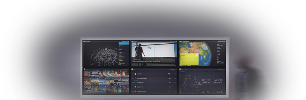
Vizia is our own tool, so of course we had to include it. It’s all about creating and presenting visualizations to make your data more powerful for your business or organization. It’s easy to upload information, while you can plug in data from loads of sources including Brandwatch, Salesforce, Google Analytics, and Hootsuite.
Vizia is often used to track business aims and KPIs, as command centers for companies, or for internal displays. It’s hugely versatile and customisable, while it’s easy to use right off the bat.
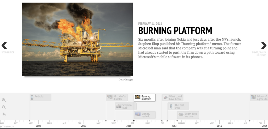
Chart Types: Interactive timelines.
Difficulty: Easy, but a little bit fiddly.
Cost: Free.
TimelineJS is very unique, offering a tool to create interactive timelines in a simple way. It’s a format that’s already been used by the likes of CNN, Le Monde, and Time. So you’re in good company if you create one yourself.
The process for making one involves filling out a supplied spreadsheet template. It’s not difficult and you get used to the set up pretty quick. From there you upload it and you can embed the timeline on your site or send it to people. Nice and easy.
Chart Types: General interactive charts, infographics, reports, and maps.
Difficulty: Easy to jump straight in and learn on the go.
Cost: Free, but with paid plans to lift certain restrictions and unlock extra features.
Infogram is another easy-to-use and versatile tool. There’s a fair few chart on offer on the free version (35+) while there’s a lot of scope for customization. The charts are interactive and easily-embeddable as well, while you can create maps too.
It always works well for reporting and infographics, with options to create entire pieces of content all within the tool. The base styles and chart designs are slick too. There’s a lot to get out of the free version.
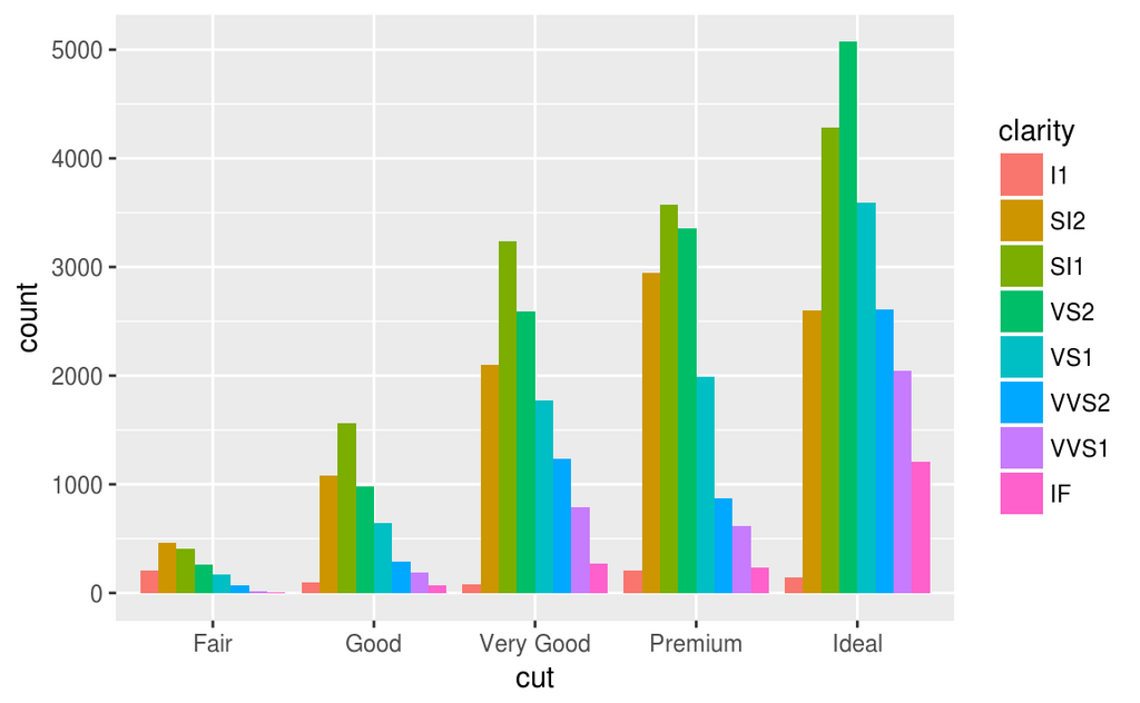
Chart Types: General, maps, technical, mathematical and scientific.
Difficulty: You’ll need a developer for this (or be willing to learn R).
Cost: Free.
R is its own statistical computing language and environment. It’s incredibly powerful and the language of chose for a lot of data scientists as it’s geared specifically towards data work. Unsurprisingly, you’ll need to spend a lot of time getting to grips with it if you don’t have someone who already has experience with it.
If you’re serious about data visualizations it is worth investing some time in R. There are a ton of tutorials and loads of plugins around meaning it’s massively versatile. You can also tackle large datasets with it and produce some incredibly interesting charts.
 Source
Gephi is a tool for creating network visualisations. They can be very simple or incredibly complex with interactivity. This is one of the more niche tools on this list, but the best one for this job. It wont be useful for all, but if you need to visualize a network this is what you need.
In terms of use, for simple projects, you could probably muddle through the tutorials and put something together, but for anything more complex you might need some specialist help from a network scientist or expert. There’s still loads of documentation online so read up and get learning.
Chart Types: General, interactive, plus some unconventional and technical charts.
Difficulty: You can jump straight in, but some chart types might take some prior data knowledge. A dev will help you get the most out of it.
Cost: Free.
RAWGraphs is built on D3.js, which is a great start. It means you can create some really great and interesting charts without knowing a lick of code. The only thing is most of the charts are for more obscure purposes. For example, there’s no basic line graph, but you can make a Voronoi diagram.
You can bring in your own custom charts, but this is where you’ll need a developer. With this option you can create some entirely unique visualizations, so this is a great tool if you’ve got a big project you can spend a decent amount of time on.
Chart Types: Various map types including choropleths, symbol, and dot-grid. Includes static and interactive visualizations.
Difficulty: You’ll need a dev for this.
Cost: Free.
If you have any Python or Javascript experience, Kartograph is really simple. It also produced beautiful maps that keep simplicity and clarity at the forefront. There’s a number of different types, including some not so common ones. There’s also the ability to render high-resolution vector maps very quickly.
Kartograph is entirely free. It’s made up of a Python library and a Javascript one, but you don’t need knowledge of both languages to put something together.
Bring your social and marketing insights to life across your organization
Existing customer?Log in to access your existing Falcon products and data via the login menu on the top right of the page.New customer?You'll find the former Falcon products under 'Social Media Management' if you go to 'Our Suite' in the navigation.
Brandwatch acquired Paladin in March 2022. It's now called Influence, which is part of Brandwatch's Social Media Management solution.Want to access your Paladin account?Use the login menu at the top right corner.