


Brandwatch Named a Leader in IDC MarketScape for Social Marketing Software for Large Enterprises
By Matt TippetsNov 22 2024
Explore the live data behind football’s biggest global tournament.
You may have noticed we’re looking a little different today. That’s our new logo, and here’s the story behind it from the person who drove its creation
When Katja and I meet, she is preparing for a big moment in Brandwatch history. Our new logo is complete, and she’s about to reveal it to the rest of the company.
It’s a nerve-wracking experience, not just because our company meetings now have over 500 attendees, but because the reaction of the company is what will determine whether her work has been successful.
This is the story of Brandwatch’s new logo, and how Katja and her team got to this point.
“I equate it to going on a hike, because it had ups and downs, it wasn’t very easy, and it made our brains ache a bit. But I had my trusty companions, the talented designers Rebecca Harrison and Christian Morris alongside me.”
Brandwatch’s logo had strong recognition in our field. It feels like us. And it’s everywhere in our offices. So, before I got to see the new logo, I asked Katja why the process for a new one was begun in the first place.
“We needed a new meaningful identity for everyone to get behind,” Katja says.
“A fresh start, in recognition of our merger and all the integration. It’s important to our collective beating heart that we can embrace and move forward with something new.
“It’s more than ‘just a logo’.”
So, with the mission of creating something new for Brandwatch as a (now much bigger) whole to get behind, the three designers began to get their heads around the brief.
“The brief was to come up with a new logo, but also a visual system which can house our product portfolio nicely, now and for the future. There’s so much to take into consideration,” Katja told me.
These considerations, it turns out, go way beyond changing our Twitter profile picture. Katja began to list some of the things that would need to be kept in mind.
“We needed to leverage the legacy from both brands – Brandwatch’s dots and Crimson’s hexagons – in a sensitive way.
“We needed to inject a cultural renewal and excitement for a new combined brand, and create global advocacy for it.
“We needed to make sure we can evolve the brand intelligently and respectfully.
“We needed to be coherent and distinct across multiple categories and products, in a way that can scale. Essentially, we were creating a visual system which we could add or change products to and accommodate products which don’t exist yet!
“And, we’re living up to being a global brand and a market leader in a competitive landscape.”
Katja takes a breath and we look at each other for a while as I do my best impression of the grimacing emoji. It’s quite the brief to receive, and the team knew they’d have to work fast.
So, the process began. And, as a nosey person, I was always trying to catch a glimpse of it.
Over in the Hub in Brandwatch’s Brighton office, the walls basically looked like one of those boards in a police drama show where the detectives are linking different people and crime scenes, only all the key suspects were odd looking shapes, and the detectives were stressed out designers.
While they looked kind of random to the outsider, they were forming the basis of the new visual system that Katja, Rebecca, and Christian were trying to come up with.
Very sneakily, the team began to road test their ideas.
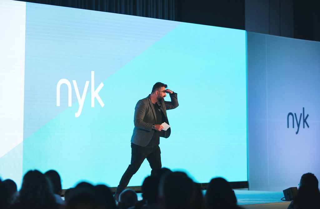
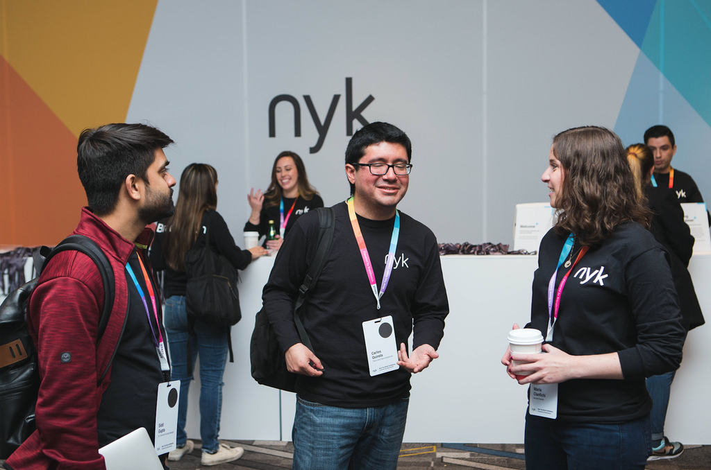
At NYK Chicago in May, Brandwatch’s new visual identity was hiding in plain site, across the main stage and the booths.
“It was a good road test that the system works,” Katja explains.
“Our visual identity isn’t 2D – it needs to come alive across physical and emotional spaces.”
With the number of events and content Brandwatch produces, and the variety of swag we have, creating something that can work on all kinds of platforms and sizes was imperative.
“Some ideas are sexy, but don’t pass all the needs of contextual application. It needs to scale from a teeny-tiny favicon to the main stage at NYK.”
So, how did we arrive at the new logo we have today?
There are several elements Katja and I chat about.
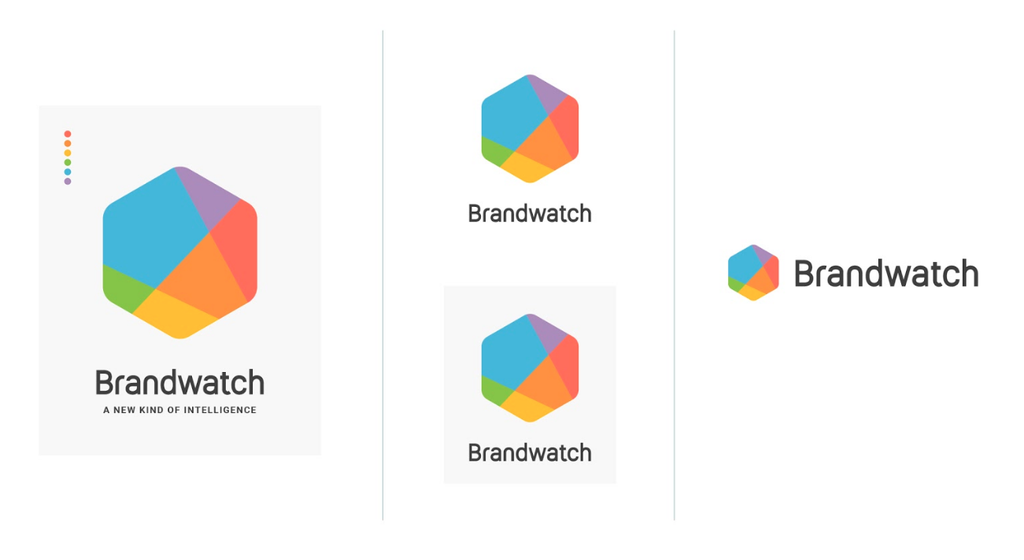
“Color is so important – to me personally and to the brand values,” Katja says. “There’s a reason one of our colors is called ‘Good Vibrations’.”
“For our brand it represents a lot of things – the diversity within our teams, our users, our data sources, our visualizations, our products. We think of our colors as ambassadors, and we apply them across our platforms, offices, and teams.”
Each of the offices now has its own color.
The silhouette of our new logo will be familiar for Crimson Hexagon customers, of course – but there are plenty of shapes going on inside it. Katja cites finding hidden gems, interesting intersections, and the synergy between art and science as inspirations for the outlines you can see.
“We wanted to codify the hexagon, taking inspiration from our data visualizations. It alludes to interesting intersections, and it can be sliced in many ways – by product, by brand attributes, by office, by values.”
The hexagon is a strong shape both in nature and architecture, and one that Katja hopes will fortify our brand for many more years.
She wants it to make a good first impression that leaves a stamp on those who see it and, she laughs, “I don’t want Brandwatchers apologizing for the design of their business cards.”
Like Katja said, it’s not just a logo.
Our logo isn't the only thing that's new
By Matt TippetsNov 22 2024
By Matt TippetsNov 21 2024
Existing customer?Log in to access your existing Falcon products and data via the login menu on the top right of the page.New customer?You'll find the former Falcon products under 'Social Media Management' if you go to 'Our Suite' in the navigation.
Brandwatch acquired Paladin in March 2022. It's now called Influence, which is part of Brandwatch's Social Media Management solution.Want to access your Paladin account?Use the login menu at the top right corner.