


Brandwatch Named a Leader in IDC MarketScape for Social Marketing Software for Large Enterprises
By Matt TippetsNov 22 2024
Explore the live data behind football’s biggest global tournament.
We've just released a whole host of new features to make your work easier. Nick Taylor explains all in today's blog.
Brandwatch users collect over 60 million mentions a day.
That’s around two billion mentions from over 80 million sites across the social web every month that need to be turned into insights that can inform real business decisions.
This is where the real work begins, and most of that work takes place in Brandwatch Analytics Dashboards.
Today we release a collection of improvements, and a whole new Summary Dashboard, inspired by requests and ideas from our users themselves to make working with Brandwatch a simpler and more collaborative experience.
Last year we launched the Brandwatch Community Forum, the first truly social space for social intelligence analysts to share industry best practices and practical tips and insights.
It’s also where our own user community can voice their opinions and offer their suggestions for the development of the Brandwatch platform.
This provides all our users with a direct line to the product team and provided us with the inspiration for many of the new features in this release.
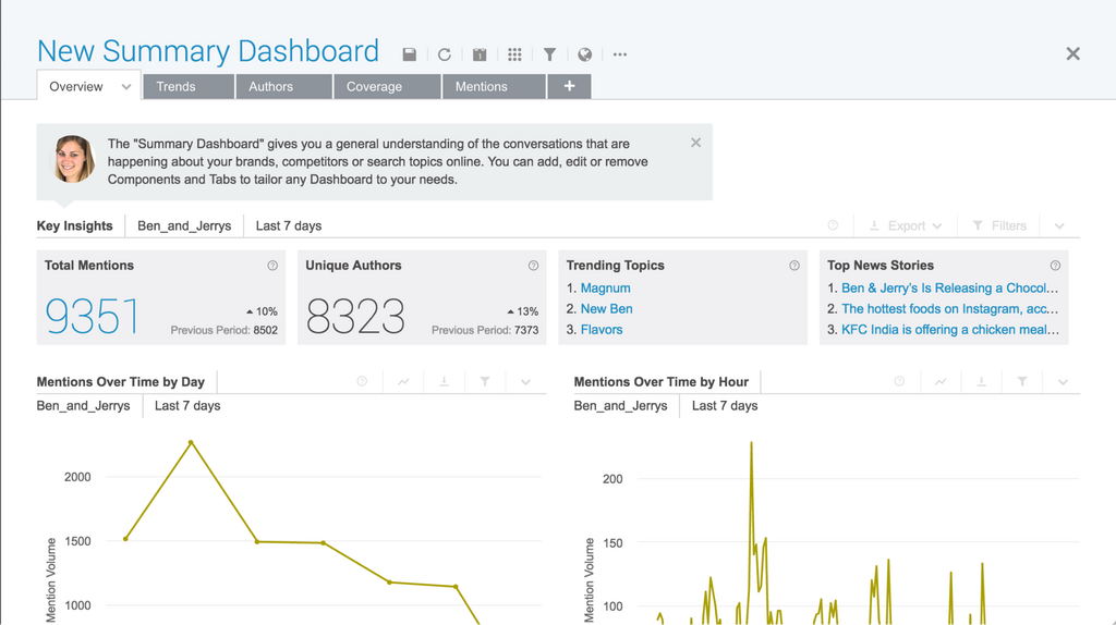 This brand new Dashboard replaces the old Default Dashboard* with a cleaner, more intuitive layout that shows off more of Brandwatch’s most popular features.
As the first thing that most users see when they start exploring their data, it was important to make the Summary Dashboard simple yet insightful.
Tabs are now arranged in an action-oriented way answering the questions: What’s being said about my brand? Who’s saying it? And where are these conversations happening?
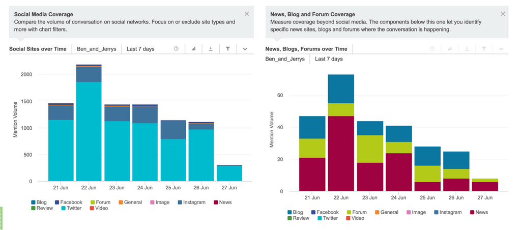
We added charts to compare mention traffic on social and news sites separately so you can get a clearer understanding of how different types of conversation about your brand are changing over time.
 We also added charts to segment data by day of the week and hour or the day, allowing you to see when, on average, your audience is most active and discover trends that can inform the timing of content marketing or customer engagement.
(*If you miss the old Default Dashboard you can still select it in the dashboard picker.)
This new chart helps you get a better understanding of what’s really trending by comparing topics that are growing and shrinking so you can respond to the most pressing issues or opportunities.
For example, in a regular topic cloud, the largest topic seems to be the most relevant, but this is not necessarily the case and it usually requires a little extra research to find out what’s going on.
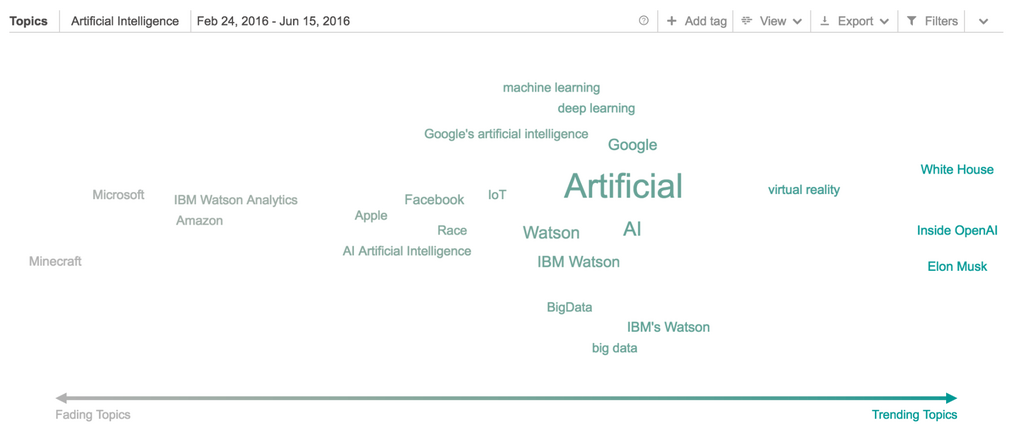
In this example looking at conversations about Artificial Intelligence between February and June we can read the situation immediately.
Topics in the center of the chart tend to be common themes that are always present such as ‘deep learning’ and ‘big data’ or brands like IBM and Google that are commonly associated with AI.
Looking to the left we can see older stories such as the integration of IBM’s Watson with Minecraft to teach medical students about how viruses function.
And to the right, more recent, trending stories such as the White House’s aim to use AI to solve problems around mass incarceration.
Have you set up the perfect Chart that you want to use in another Dashboard?
Now you can copy and paste it instantly without having to recreate any filters or views.
 You might be working on several different data sources and you want to repeat a particular view for each one. Or you might have seen something brilliant in a colleagues dashboard that you want to recreate in your own.
Spot insights more easily across different Charts.
Topics, Queries, Authors and almost anything else will now keep the same color wherever they appear within a Dashboard.
Share information or opinions more clearly with formatting, images, gifs and links in any Note Components.
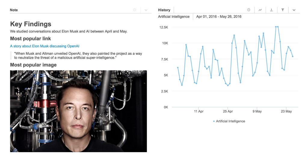 Note components can be added anywhere in your Dashboards to provide more context to others reading them or to store reminders of what’s being looked at in the Dashboard.
You might want to attach the actual images from a campaign that you’re studying, or you might link to external stories or user profiles that you have found so you don’t lose them when the data changes.
Or, you might just want to make your notes look a little more polished.
You can view all formatting options available with the link below the note editor.
Log in today to start trying these out.
And don’t forget, if you have any feedback about these features or ideas for new ones, you can join the discussion at the Brandwatch Community Forum.
Consumer Research gives you access to deep consumer insights from 100 million online sources and over 1.4 trillion posts.
By Matt TippetsNov 22 2024
By Matt TippetsNov 21 2024
Existing customer?Log in to access your existing Falcon products and data via the login menu on the top right of the page.New customer?You'll find the former Falcon products under 'Social Media Management' if you go to 'Our Suite' in the navigation.
Brandwatch acquired Paladin in March 2022. It's now called Influence, which is part of Brandwatch's Social Media Management solution.Want to access your Paladin account?Use the login menu at the top right corner.