


5 times non-sponsor brands shined during this football summer
By Ksenia NewtonJul 16
Explore the live data behind football’s biggest global tournament.
Visme's Chloe West shares her design tips for creating killer research reports that give the insights the best chance of being actioned
People work hard on generating data that can help their business, but all too often that data isn’t shared in a way that means others can act on the insights.
To help your report really stand out and ensure your information is as comprehensive, digestible, and actionable as possible, you want to put a lot of emphasis on your research report design.
Here are some tips on creating engaging research reports that easily convey your point and help your colleagues take action.
While everyone is used to receiving PDFs, that doesn’t have to be the only way you share your data and other information.
Instead, play with other research report formats, like a presentation, infographic, or even a live data report with real-time displays.
The best way to decide which format to use is to think about the amount of content you have to put into your report, and the best way to present those different pieces of information in the context of your business. You should also gather feedback from those you’re creating the report for on their preferred methods of receiving information. If they want a quick update, a simple one-page report might be your best bet.
From the very first page, slide, content block, or whatever starts off your report, you want to reel your audience in.
The first thing they’re likely going to see is a report cover page, so you want to make a great first impression. Your colors, fonts, and images matter.
Titles and subheadings help set expectations, so make sure that they’re 100% accurate and give the reader an indication of the value they will get from the report. Create a clear and concise title in a large font and a descriptive subtitle directly below it to convey your report’s contents.
You’ll also want to include visuals that grab your reader’s eye and get them intrigued to read more. This can be stock photos, graphic illustrations or even animated icons. Just make sure they’re relevant and, especially if your report is around something sensitive, well thought out.
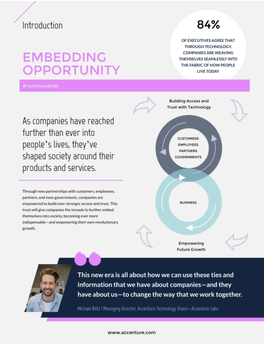
Take a look at this report’s cover page as an example.
The large font stands out as the title, with the subtitle underneath explaining what the reader can expect. The color scheme is warm and welcoming, and the background photo illustrates the report’s topic.
Note: See ‘9. Brand your report’ below.
No one wants to read a document or presentation that’s full of intimidating, dull-looking walls of text. When creating a research report with design in mind, it’s important to break up text into paragraphs, callouts, visuals, and other design elements to help make your content easy to read.
Take a look at this report page as an example.
By using various fonts and font sizes, as well as background colors to create accentuated callouts, this report page content is incredibly easy to digest.
Make sure to keep your report content concise and use visuals whenever you can to convey your point instead of another paragraph of text, especially when writing about something complex.
We mentioned callouts in the last point, but we want to call them out a little bit more. Callouts are blurbs that help to accentuate important points within your report.
You want to use your report design to put emphasis on the most important bits of information so your reader has the option to easily skim and grasp the must-know facts.
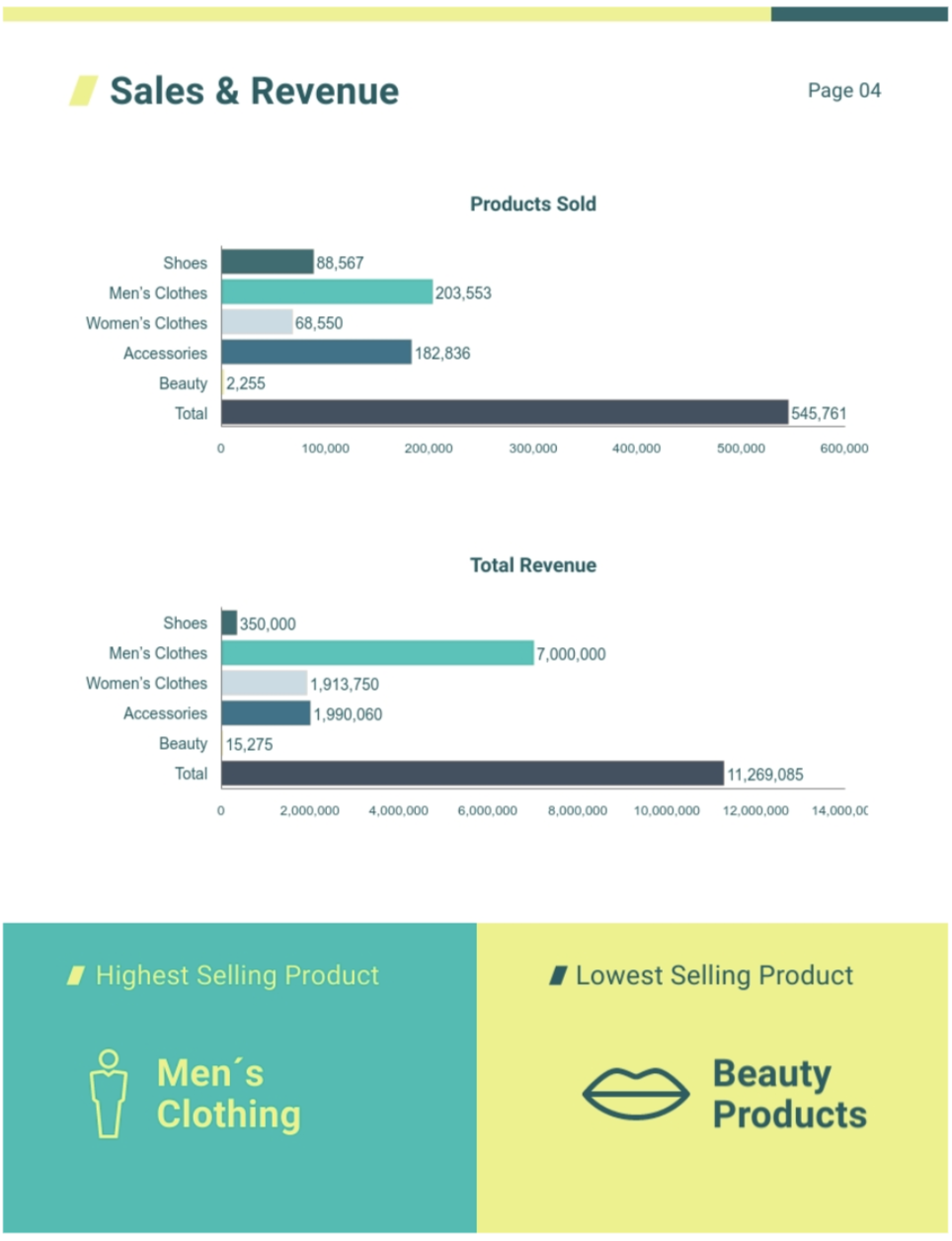
The bottom elements of this report page below are great examples of this.
Although users could look to the bar graphs and determine which products are highest and lowest performing, the callout at the bottom immediately lets the reader know at a glance.
If you have any important numbers to share within your research report, use data visualization to do so. Charts, graphs, pictograms, and other tools are great ways to showcase numbers at a glance.
It’s important to remember, though, that you want your charts to be clear and concise rather than flashy. Data visualization is supposed to highlight your report’s data, not to distract from it.
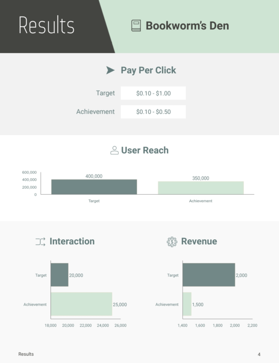
When referring to something like social media performance, data visualization is the perfect way to demonstrate success.
Rather than trying to explain performance in a paragraph filled with numbers, this example is using charts to demonstrate how well or poorly the ads did for a quick, at-a-glance insight.
Make sure you use the best chart or graph for your data so that your information is clearly conveyed, and ensure that you label data correctly so all the important information is easily available for the reader.
Give yourself a good bit of space around the edges of your report design. Taking up the full amount of page space can make your report look cluttered, so it’s important to allow yourself some negative space.
This report page is a great example of both margins around your page edges and white space between your elements so your report feels clean and minimalistic.
Ensuring there are margins and space between your design elements also gives your reader the perfect opportunity to take notes if the report is printed off or accompanying a presentation.
You can convey your information with more than just text and charts. Incorporating images, icons, and illustrations into your research report is another great way to help your reader navigate the pages.
If you create a digital report, you can even embed video clips or upload GIFs or other animated elements to your document.
Take a look at this report page to see how visuals can help break up content.
The stock photos interlaced with the text areas help to provide a visual balance in the report, making the content more visually appealing and easy to read. The trick is not to over-do it or use confusing or distracting images. You want readers to focus on the information.
Whether you’re creating an online presentation or a digital document, interactivity can make it even more engaging.
Find a way to make your report interactive by adding audio, embedding videos or past live streams, or enabling the reader to click on charts or prompt animations.
At the same time, be sure to keep in mind that time-short readers just want the insight directly from your report, so don’t add things that aren’t necessary. Your report shouldn’t be flashy, just engaging and easy to read.
A great example of interactivity that can add to your report is having your chart legends appear as your readers hover over each different bar or line in your graph.
You can easily share your interactive, digital reports via an online link or by embedding them on a landing page on your website.
There are some instances where you might want to encourage the reader to seek out their own insights through interactivity. The Pudding creates amazing data visualizations that encourage user interactivity. But, generally speaking, if you’re delivering business insights or corporate training information, you should keep things as to-the-point as possible.
Incorporate your brand colors and fonts into your report so it’s obvious that it belongs to your company.
Your company likely already has branding guidelines that help you understand how your colors and fonts should be used in documents or presentations. You might also have ready-made templates..
Even if it’s just an internal report, using your brand colors, fonts, and logo can give your report a more professional feel which can help add weight to the enclosed insights.
Once you finalize your design, save it as a template to reuse over and over again. Next time you need to create a similar report, you can simply copy and paste your data and update the information.
This’ll help make your job easier each time you have to create a report. Even with research reports that are directed at a different audience or needed for a different person, having a template as a starting point will be a game changer. Working with your design team to create these templates can ensure the branding is consistent.
Ensuring your business insights are seen throughout the organization is important – if no one reads them, they won’t be acted upon.
By improving the design of your report to allow for maximum engagement and readability, you’re a step closer to creating a bigger impact with your research and analysis.
Consumer Research gives you access to deep consumer insights from 100 million online sources and over 1.4 trillion posts.
Existing customer?Log in to access your existing Falcon products and data via the login menu on the top right of the page.New customer?You'll find the former Falcon products under 'Social Media Management' if you go to 'Our Suite' in the navigation.
Brandwatch acquired Paladin in March 2022. It's now called Influence, which is part of Brandwatch's Social Media Management solution.Want to access your Paladin account?Use the login menu at the top right corner.