


5 times non-sponsor brands shined during this football summer
By Ksenia NewtonJul 16
Explore the live data behind football’s biggest global tournament.
Entertainment was to lockdown as Dick Van Dyke was to Julie Andrews in Mary Poppins. Each of us were the main characters of our own lockdown stories but we needed the supporting role of entertainment to keep us laughing and getting through.
Without our favorite shows and movies by our sides, life would have been even harder.
In 2020, we saw really interesting innovations and some surprising trends in what was popular. Turns out, 2021 was similarly surprising with some new players in the entertainment trends mix. Let’s explore.
If you had told us in 2019 that podcasts would skyrocket to the top of people’s minds for entertainment in 2020, we probably would have disagreed. But fast forward to 2021 and podcasts are still riding high on that pandemic momentum.
The data on podcast consumption clearly charts this impressive progress.
With these surveys carried out in the spring, 2021’s number reflects the world since the pandemic shook everything up. If you felt you listened to more podcasts during the pandemic, this data shows you certainly weren’t alone.
There is clearly a huge appetite for this format, and the US and UK are by no means the exceptions. According to the Reuters Institute, when looking at monthly podcast listening, those in Ireland, Spain, Sweden, and Norway all consume more podcast content than the US.
So what does this mean for the industry? Well, podcasts are here to stay. Advertising dollars could be well-placed on popular industry podcasts – put your money where your audiences are.
Twitter is a gathering place for people to share, well, whatever they want. That includes lots of public figures.
Whether or not these influencers should be tweeting for themselves is a question for their PR Teams. But for leaders in entertainment or marketers in any industry, it’s important to keep an eye on who’s hot at the moment. This can help guide decisions around influencer marketing and sponsorship deals.
In 2021 – for the second year in a row – ‘musician’ appears to be the most influential profession on the platform, with 54% of the top 50 influencers falling under this category. ‘Television host’ is the second most influential profession on Twitter, with 12% of the top 50 influencers sitting in this category.
Business, sports, and politicians each accounted for 6% of the ranked influencers’ professions. Unlike in 2020, only two politicians appeared in the top 10: Barack Obama and Narendra Modi.
What we’re seeing here is a lot of influence emanating from the entertainment sector since the pandemic began, during a time when for many listening to music and streaming TV and movies was pretty much all there was to do. That context could help explain the shift in influence from politics in 2020 to entertainment in 2021.
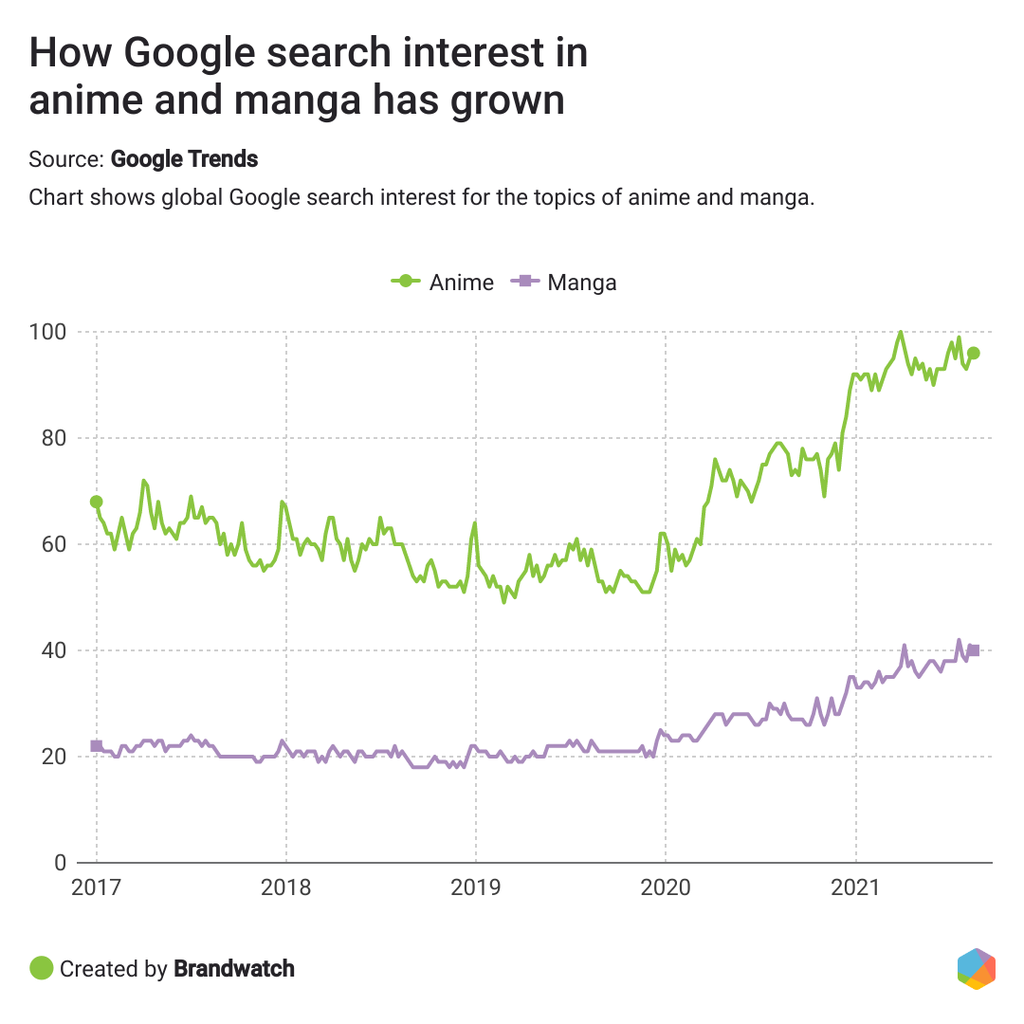
Anime and manga weren’t exactly synonymous with ‘cool’ in the early 2000s. In fact, search interest in anime was actually decreasing up until 2019 when levels stabilized. That’s why it was surprising to see a sharp uptick in March and April 2020, suggesting that the pandemic renewed interest in the medium.
Come 2021 and searches are at historical highs with no sign of decreasing. From the popularity of Studio Ghibli films to Netflix commissioning their own anime series, Japanese animation and comics are becoming more mainstream across the world.
While there’s far less global interest in manga, it’s also seen a healthy increase in search interest since 2020.
It’s not just search interest that’s ramped up, either. As more people have looked into anime and manga using Google, a jump in content published on the topics has followed.
According to BuzzSumo, when comparing 2021 to 2020:
That’s a staggering increase, and one that’s been met with a very positive reaction.Of the anime content shared to Facebook this year, 63% of reactions were “love”, with only 1% being “angry”. For manga content, these numbers were 55% and 1% respectively. It would be wise to keep an eye on these categories as they only seem to be increasing in popularity.
Online streaming platforms have kept captive audiences entertained since the pandemic began, and many of us have splashed out on new on-demand video subscriptions during that time.
But on the business side, streaming platforms are engaged in a fierce battle for market share. That means paying attention to customer pain points (or positives!) is more important than ever. When there is a razor-thin margin, it only takes a small misstep to lose a customer.
We created search queries for mentions with phrases like “I hate when” or “annoying when” appearing near the names of popular on-demand video services to track down some of the most common gripes.
We searched for these in public social media posts (excluding retweets), blogs, forums, etc from January 2020 to June 2021. Out of the 7,000 mentions, we broke down the three most common complaints.
Even if you tried, you can’t really ignore K-Pop. From BTS to Blackpink, we hear their tunes on the radio and enjoy their performances at all of the major award shows.
You can read all the fun facts about BTS in our dedicated blog here, including the fact that there have been an average of 958,597 mentions daily about the band since 2013. But something to look out for in 2022 is how all that influence continues to translate into cash.
One way that could continue to manifest is in livestream shopping events which have seen a massive increase in popularity in recent years. K-Pop groups like Got7 have led successful livestream events that have generated huge amounts of interest and revenue for online retailers.
K-Pop bands like BTS will continue to dominate the charts and there will be many more influencer campaigns involving these budding stars in the future.
Change is the only constant, and businesses everywhere have learned this lesson. The key to breaking through the noise in any given industry is a willingness to adapt and pivot.
The fastest way to understand what your consumers want is to meet them where they already are: the internet.
Consumer Research gives you access to deep consumer insights from 100 million online sources and over 1.4 trillion posts.
Existing customer?Log in to access your existing Falcon products and data via the login menu on the top right of the page.New customer?You'll find the former Falcon products under 'Social Media Management' if you go to 'Our Suite' in the navigation.
Brandwatch acquired Paladin in March 2022. It's now called Influence, which is part of Brandwatch's Social Media Management solution.Want to access your Paladin account?Use the login menu at the top right corner.