


20 Social Media Holidays to Celebrate This May
By Yasmin PierreApr 10
Read the practical framework for leveling up your social media team.
Published December 11th 2023
The number of social media conversations happening at any given time is massive. They ebb and flow with the news and cover every conceivable topic. From grandparents sharing old photos on Facebook to endless pop culture debates on Reddit.
Social listening means taking all these conversations and getting meaningful insights out of them. This guide will take you through all aspects of social listening and how it could be of use to you.
In this blog, we’ll cover:
But first things first.
Social listening, also known as social media listening, is the process of monitoring online conversations and collecting data from social platforms and forums on a chosen topic. This could be a brand, an industry, or anything at all. These insights subsequently inform and shape effective marketing strategies, positioning businesses to better cater to their audiences.
The collected data is then analyzed to find trends and useful insights to help brands understand their consumers’ mindset, evaluate the brand’s presence online, and further clarify its place within the market. These insights then get fed into product development, business operations, marketing, advertising, and many other areas of the business.
It’s not an entirely new approach. Brands have been trying to gauge the opinions of the public and their customers with surveys forever. But with the right technology, discovering and analyzing unprompted and non-incentivized consumer opinions becomes a lot more efficient and cost-effective.
Social media is a crucial source to discover emerging trends before they get big and are covered in other media. Platforms like TikTok or Instagram are the place of origin of many trends in the past. They are a catalyst for trends, having the chance to go viral. Brands need to monitor these social media conversations to avoid missing out on opportunities.
Consumer behavior is constantly changing, and brands that don't pay attention risk making poor business decisions and losing customers to competitors. Social data provides valuable insights into consumer opinions, needs, and common pain points. With a smart social listening setup, brands can monitor how consumer behavior changes over time, what product features they like, and what they say about their competitors’ customer experiences.
Social listening can help identify emerging social media trends before they take off. Brands that jump on the bandwagon early can ensure they stay relevant and top of mind with their customers. Insights into the latest social media trends can inform a variety of different business departments, such as marketing, advertising, customer service, or product development.
Advanced social listening platforms can provide insights into social media trends at scale. They can help brands deep-dive into consumer opinions about a specific industry, such as food and beverage, their brand experiences, or how they communicate online.
Here are some of the benefits of social listening and why it is important:
We’ll get into more depth shortly, but first, we’ll use a quick example to show how important social listening is.
Imagine you’re Ben & Jerry’s, and you’ve got a big social media ad budget to get people buying your products. Following common sense, you put more money in during the summer, and you also keep an eye on the forecast. When it’s sunny and hot, you give your ads another boost and fine-tune your messaging.
All very sensible and a tactic that likely works very well. But then you notice something. A snowstorm that was talked about all week in the local press hits New York. In anticipation, you leave your ad budget for the city unchanged or even lower it, assuming the last thing people want during cold weather is a cold dessert.
But upon checking your ad’s performance in New York over the weekend, you see click-through rates have jumped up. When the sales figures come through for that weekend, you see they’re up as well.
What happened?
Using a social listening tool, you could easily find out. And this is exactly what Ben & Jerry’s did.
They looked at mentions about their products on sites like X (formerly Twitter) and Instagram and noticed there was an uptick during poor weather, particularly when it was rainy. By combining those data sources (weather and social), they found a massively valuable insight (this is one of the big benefits of consumer intelligence).
It turned out that when rain forced people to stay in watching TV, they wanted ice cream to go with it. In other words, lots of social media posts like this:
This opened up a whole new area for Ben & Jerry’s to target. Now, they would look for rain in the forecasts, as well as sun, and adjust their marketing plans accordingly.
They even went a step further and created a flavor just for this purpose: Netflix & Chill’d.
This was all achieved with a straightforward social listening approach, which worked wonders for Ben & Jerry’s. Considering you can conduct brand management, track PR issues, and influence product design too, it becomes clear just how powerful and invaluable social listening is.
You may have heard these other terms and thought they were pretty much interchangeable. There is a lot of crossover between these terms, but there are differences. We’ve already defined social listening, so let’s go through the other two.
Social media analytics (or analysis) is the process of actually analyzing that data, again, often with a tool like Brandwatch.
The analytics part is finding insight from the data – What are people saying about your brand online? Who are the influencers pioneering these conversations? How is the industry changing? And where in the world do most of the conversations take place? That involves tools and features such as author analysis, page type analysis, and topic and sentiment analysis.
The term is often used to describe social media monitoring or social listening, as generally, you don’t listen or monitor without analyzing the data – and usually, you’d use the same tool for both stages.
Social media intelligence covers the knowledge or insights gained from analyzing social media data.
That could be, say, the knowledge that your customers hate a feature of your product, which can then inform your product development team. In one of our case studies, Fetch Rewards shared how with the help of Brandwatch Consumer Research, the Fetch team was able to quickly discover negative sentiment around its newly released app feature and inform the leadership team.
Social intelligence could also be the knowledge that your target audience really loves rap music right now, so that’d be a good thing to capitalize on in your marketing.
They’re the kind of insights that our clients have detailed in these case studies about their use of Brandwatch.
Social media intelligence is ultimately about helping make business decisions based on social media analysis and data. It’s often also called social business intelligence for this reason.
People talk about everything online. That means there’s scope for pretty much any company or organization to use social listening. As long as it’s done properly, there’s something to be learned.
If you’re a B2C company, then it’s a great way to hear what your customers are saying about your brand. Do they speak highly of you or are they praising your competitors’ customer experience? You can see which products get discussed the most, collect feedback, and learn more about their demographics.
Not only that, you can use it to build research for your business strategy. Maybe you’re looking to branch out into a new product area. You could see what people are saying about it already, and even see if your existing customers would be interested in the new product, too.
For a B2B company, social listening can be great for competitive benchmarking as well. You can look at who of your competitors has the largest share of voice or keep an eye on the latest developments. That’s on top of learning more about potential customers.
For example, while you sell to businesses, you still need to connect with people to make that happen. You could work out your target decision-makers, such as CEOs or CTOs, and use social listening to see what they’re interested in, their demographics, and how to interact with them.
From cancer awareness to the local museum, charities can also use social listening. Looking at conversations around certain topics can give great insight into the work you do. That’s not to mention brand monitoring, so you can be aware of anything negative being said about your organization.
Social listening could even feed into your next campaign, helping you identify and attract new audiences and potential donors.
Here’s one example of charities leveraging social listening. The global youth charity Ditch the Label teamed up with Brandwatch to publish an insightful report based on analyzing 263 million online conversations to understand how hate speech evolved in the US and UK between 2019 and 2021.
With the right technology, gathering useful and actionable insights about investment decisions couldn’t be easier. Traditionally, when it comes to investigating potential investment opportunities or due diligence, private equity deals could take months to close because the research process around it is known to be labor-intensive and costly. Digital consumer insights can come in handy to those investors who are looking to gather intelligence at a quick scale while increasing confidence in their investment recommendations.
Even government departments can get involved with social listening: from understanding demographics to surfacing complaints and other feedback on new policies or strategies.
For example, the Abu Dhabi Department of Culture & Tourism (DCT) works on developing and marketing Abu Dhabi’s tourism industry, and it uses social listening to monitor conversations on social media to understand the type of content the audiences wish to see on each channel.
That’s just one example. You can see our full case studies here. They cover plenty of business types and industries.
Generally, you will need a dedicated tool or platform to carry out social listening. You could do some basic things by tracking mentions of certain terms using something like Google Alerts, but it’s always going to be surface-level.
A tool like Brandwatch Consumer Research covers everything you’ll need for social listening. You can find out more about it and book a free demo here. You can also check out some other social media monitoring tools here. While there are several free options, they’ll only let you scratch the surface. A paid solution, on the other hand, will help you uncover deep insights about your audience and industry.
Once you’re ready to start, here are the questions you’ll need to answer in preparation:
Let’s explore each of these below.
The first thing is to write down your goals. You can do so many things with social listening, so it’s easy to get unfocused. From simply seeing who talks about your brand to setting up a crisis alert system, you need to know exactly what you want to achieve from the beginning.
For some people, social listening will become part of an ongoing strategy. Others might be looking for the answer to a single question. Talk to your team and decide what you want to achieve.
Here are a few examples of what you can do:
Once you have clear goals, you can work out what data you’ll need. Speaking to stakeholders directly involved in these areas is very important.
Your customer service team will know the common talking points customers have. Your campaign managers know which metrics are important. Your business development department knows what potential clients like to hear.
Work with them to build a checklist of data points they’d find useful to achieve the stated goal. You then use that to set the parameters for your data collection. This could be looking for all brand mentions to conversations around a specific subject.
You also need to decide how much data you’ll need or, in other words, how long of a period you’ll be “socially listening.”
For some projects, such as for customer service, this will be ongoing. But in other cases, you’ll need to get more specific. Do you need a year’s worth of data? Should it come from one country or globally? Do you want to collect data across the internet or just forums, for example?
What you’re trying to find out will determine all this. Covering a useful amount of time is one of the most important parts. You can’t identify trends in the space of a week. Make sure you’re capturing enough data to make proper insights you can actually action on.
As we’ve said, there’s a whole range of reasons for conducting social listening. That means we can’t cover everything, but here’s some general advice when dealing with data.
We’d also suggest taking some free courses in data science to get you on the right track. There are loads of free courses online, but Coursera and edX are good places to start. If you are already a user of a social listening platform, check their website to see if they offer some training courses.
Social listening data can often be noisy and messy. You’re always going to pick up stuff that’s not relevant to your search criteria. Sometimes, this will be negligible, but often, it can throw any insights off.
The first thing to do is manually check what you’ve collected. You don’t need to look at every single data point, but if something’s gone wrong, you’ll be able to spot it.
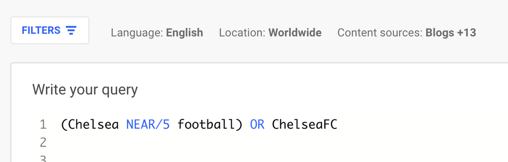
For example, you’ve decided to collect posts on X (formerly Twitter) around the UK soccer team Chelsea. You pick up mentions of ‘Chelsea,’ but with it comes a load of stuff about the location, the TV show Made in Chelsea, and people called Chelsea.
That’s not ideal. Luckily, you just need to redefine what data you pick up. Instead, you only pick up mentions where ‘football’ is mentioned within five words of ‘Chelsea.’ You might include hashtags relating to the team as well.
After that, your data will be far more focused. The main lesson is not to take your first set of results for granted. You are never going to get it right the first time, and it will always be a process of constant refinement. Check and double-check your results before assuming your data is useful.
This is where the free courses we mentioned will come in handy. It can be tough to know where to start, especially with a large dataset. The goal of your project will be useful in guiding this process. Meanwhile, making sure there’s enough data is important too.
Advising on how to analyze data is a whole other blog post, but here are a few common things to look out for that offer some insight:
If you’re going to be collecting data indefinitely, it’s important to get this right as early on as possible. If, after six months, you realize you’ve been collecting the wrong data or missing important areas, a lot of hard work is going to go to waste.
As we said before, get all of the relevant teams involved. Get continuous feedback to spot any problems quickly. Conversations online evolve rapidly. New words, products, and even memes could end up skewing your data unexpectedly. Always check your results.
You’ll also want to update what you’re tracking for the same reason. If a new competitor appears or you launch a new product, you need to make sure you’re collecting data to cover these events.
Now that you have an idea of what social listening is and what kind of insights you can collect, you may ask yourself how to find the right social listening tool. Finding the right social listening tool is crucial to getting the best results for your money. Which social listening tool is right for you depends on several factors, including your budget, needs, team size, and use case. There are a variety of social media monitoring tools on the market, some of which are free with basic analytics that are suitable for smaller companies on a tight budget.
But if you want social listening with deeper insights and more analytics capabilities, you should take a look at sophisticated social listening platforms with paid plans. With these social listening platforms, you can choose from a variety of data sources, data segmentation and visualization options, and workflow and user features to manage the responsibilities and access of your team members.
Advanced social listening tools, such as Brandwatch Consumer Research, also have alerting features that can email stakeholders when there are unusual changes in the data or a spike in negative mentions that could indicate a potential threat. AI capabilities and templates can help you save time and gain more valuable insights. Also, look at what kind of customer service they offer, such as a dedicated account manager.
Depending on your social listening goals, needs, and budget, you should be able to come up with a catalog of questions to ask potential vendors to determine if they can meet your needs. For inspiration, check out our buyer's guide, which provides a list of questions you can ask.
Here are some areas your questions may cover:
Once you have the answers to your questions, the decision should be easy. The vendor that checks the most boxes is the right social listening tool for you and your team. Over time it can be worth reevaluating your social listening vendor in case your social listening needs have changed.
Now that you've chosen the right social listening tool, it's time to put theory into practice. There are multiple steps, from data gathering to setup to analysis, that you will go through when you work with a social listening tool.
Using a social listening tool can be broken down into four steps:
Here’s a quick overview of what these four steps look like with Brandwatch Consumer Research:
1. Search
Search is the first step in your social listening setup. It's the foundation of your analysis and will help you get the relevant data you need. In the search setup, you can use different filters and operators to refine the data.
2. Segmentation
Once you've set up your search and received your data, it's time to segment. Segmenting the data can help you visualize the data into meaningful graphs that can help you gain insights.
Social listening tools have a wide variety of features you can use to slice and dice your data. For example, you can see the sentiment of consumer conversations, the emotions they are expressing in their discussions, and demographic details such as location or age.
3. Analysis
Next, you can begin to analyze the data and identify valuable insights. These insights will help you answer the questions you had at the beginning of your social listening setup.
You can answer questions such as:
4. Action
Now it's time to turn your insights into action and make smarter business decisions. Sophisticated social listening platforms offer a variety of tools to help you keep stakeholders informed, such as email alerts or reporting features to make your life easier. This can help you put the insights at the fingertips of decision-makers so they can make smarter, data-driven decisions to improve the business.
There you have it. Social listening can help you cut through the noise and monitor online conversations over time to stay on top of the latest changes and trends.
You should now have a good idea of what social listening is and how it can benefit your brand. Choosing the right social listening tool is important for getting the best results for your money.
Done right, social listening is incredibly powerful. Sophisticated social listening platforms offer a wide variety of features that allow you to dive deep into online consumer conversations. Social listening insights help you to get a better understanding of your consumers, improve your product and services, and ultimately boost sales.
Remember to take action after you have gathered your insights. Share your findings with relevant stakeholders so they can have an impact on future business decisions.
Do you want to learn more about Brandwatch Consumer Research and how your company can benefit from social listening? Get in touch for a personalized demo.
Offering up analysis and data on everything from the events of the day to the latest consumer trends. Subscribe to keep your finger on the world’s pulse.
Consumer Research gives you access to deep consumer insights from 100 million online sources and over 1.4 trillion posts.
Existing customer?Log in to access your existing Falcon products and data via the login menu on the top right of the page.New customer?You'll find the former Falcon products under 'Social Media Management' if you go to 'Our Suite' in the navigation.
Brandwatch acquired Paladin in March 2022. It's now called Influence, which is part of Brandwatch's Social Media Management solution.Want to access your Paladin account?Use the login menu at the top right corner.